Colors

Clean and simple
The Administration and other Shopware services and products use an overall minimalist and clean design, reserving colors only for the most important elements. This allows for good focus with minimal distraction.
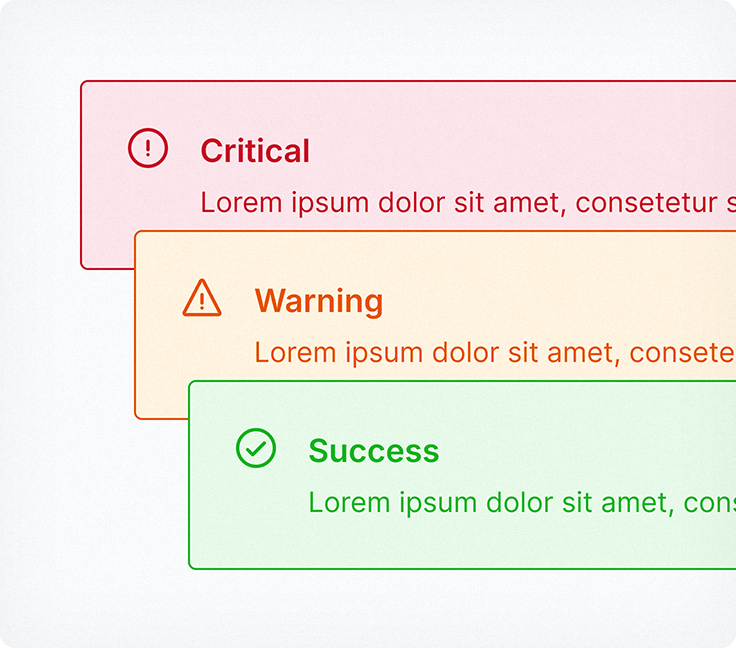
Signal colors
Signal colors used in Shopware products follow familiar patterns, making them simple and straightforward. Red is used for critical actions, orange is used to get the users attention, and green is used to highlight positive events.
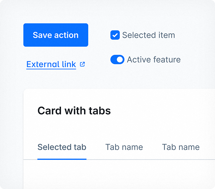
Primary color
Blue is the main color used for primary actions such as Save, Next, or Install. We also use it to indicate checked states for checkboxes, radio buttons, and buttons. Lists and tabs also follow a similar blue flow with a light blue hover effect.