Token overview
What are tokens
Design tokens are standardized name-value pairs that encapsulate design decisions such as colors, typography, spacing, and motion. They act as a bridge between design and development, ensuring consistency across different platforms and tools. By abstracting raw values into meaningful names, design tokens enable scalable and maintainable UI systems.
Token names explained
A design token's name conveys its intended use, with each part specifying a distinct aspect of its function
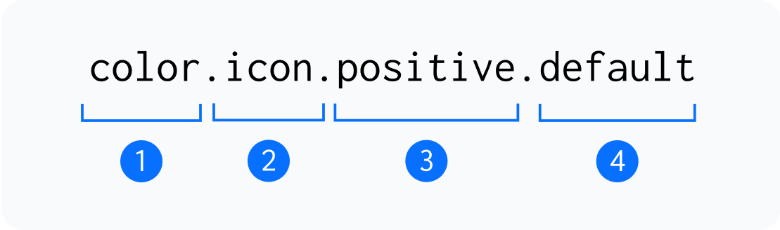
1. Type
This represents the broadest classification of a design token, defining its general purpose, such as color or typography.
2. Category
A more specific grouping within a type that organizes tokens based on their functional role, such as icon, text, or elevation within a visual design system.
3. Instance
A category that represents distinct usages like primary buttons, background surfaces, or success indicators.
4. Variant
A modification of an instance that adapts it for different contexts, such as hover for an interactive state or bold for an emphasis variation.
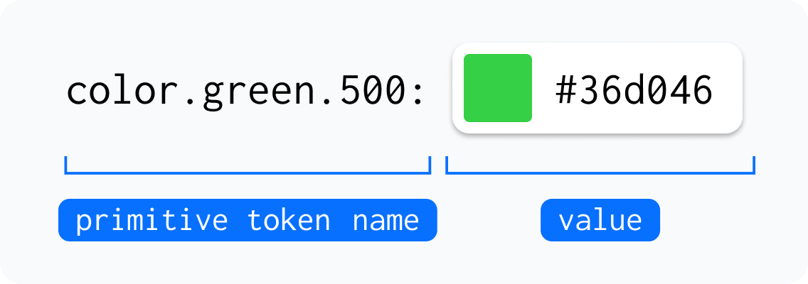
Primitive
These are foundational design tokens that define raw values, such as colors, spacing, or typography, without being tied to a specific use case. For example, color.green.500 represents a specific shade of green that can be applied across different components and contexts.
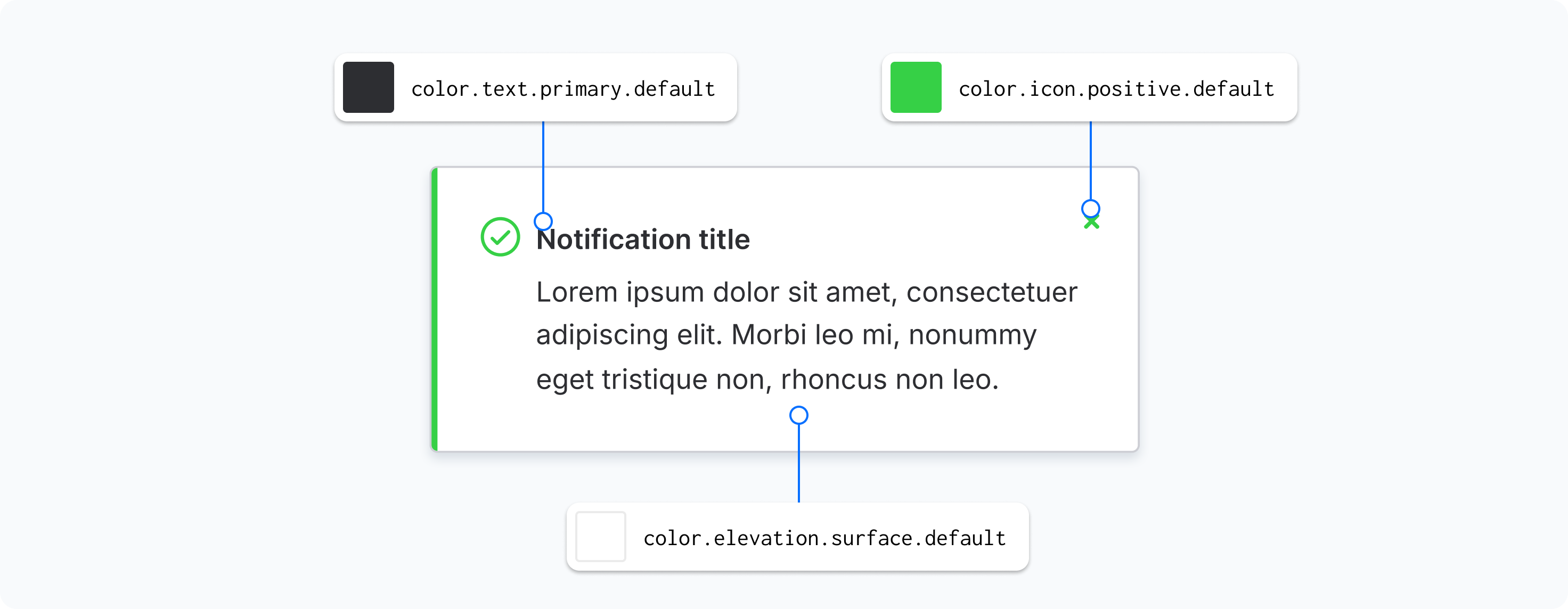
Semantic
These tokens are context-driven and map to primitive values, providing meaningful names based on their intended usage in the design system. For instance, color.icon.positive.default applies a predefined color to icons that indicate positive actions or statuses, ensuring consistency across the interface.
