Components
Feedback indicator
These indicators components will help the user understand what's going on in the administration. Elements like banners that will show valuable info or loading indicators that show a process is loading.
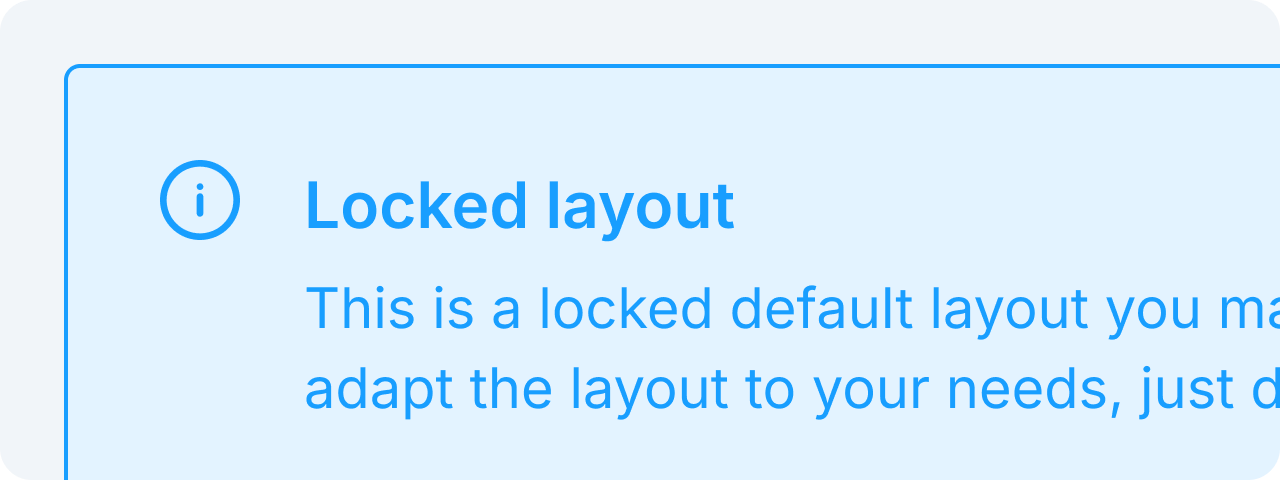 BannerBanners provide contextual feedback messages.
 LoaderLoaders indicate ongoing processes.
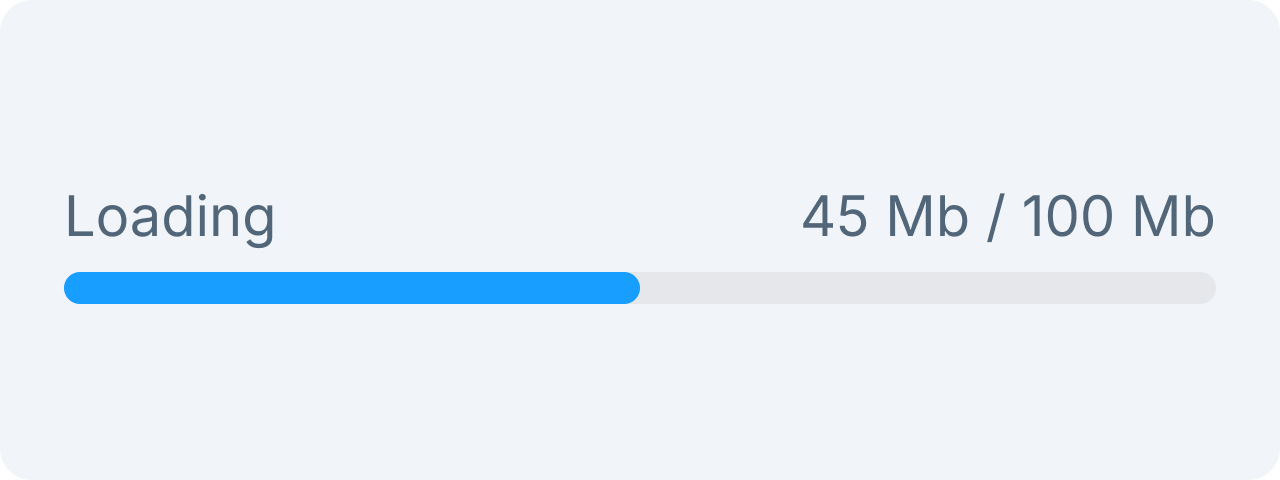 Progress BarProgress bars show task completion progress.
Form
Form elements are components within our admin to show and edit data. These elements include text fields, checkboxes, radio buttons, dropdowns, and more.
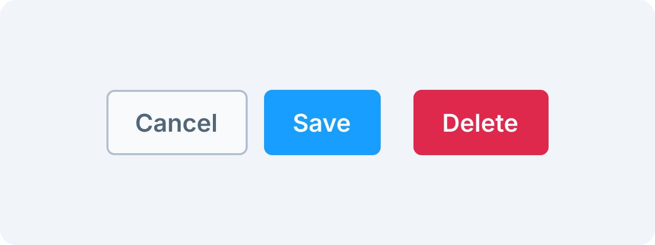 ButtonButtons trigger actions.
 CheckboxCheckboxes allow multiple selections.
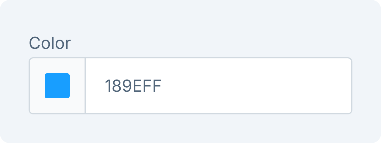 Color PickerSelect colors easily.
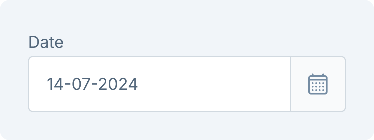 Date PickerSelect dates efficiently.
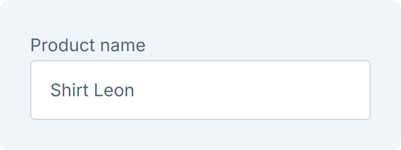 Text FieldEnter text inputs.
Layout
The layout components are the main elements of the page that provide structure and organization to the content. They are responsible for holding and displaying the different parts of the page in a logical and consistent manner.
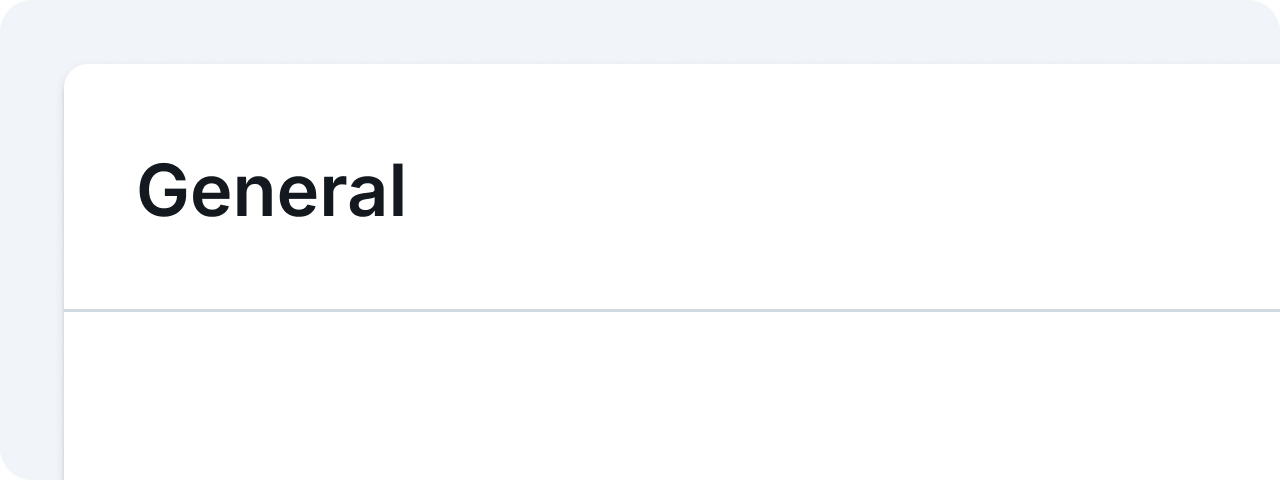 CardEncapsulates content in a structured way.
Navigation
Navigation components such as search and tabs can help users easily locate desired content.
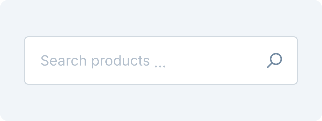 SearchAllows users to find information quickly.
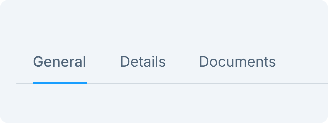 TabsOrganize content into sections.
Overlay
Overlay items are temporary components placed on top of main layout components with a shadow to enhance visual elevation.
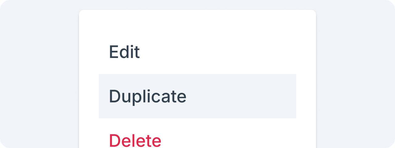 PopoverPopovers allow users to access a list of temporary choices or actions.
Table and list
Table and list components are used to present interactive data that can be ordered, searched, and edited if the UI allows it.
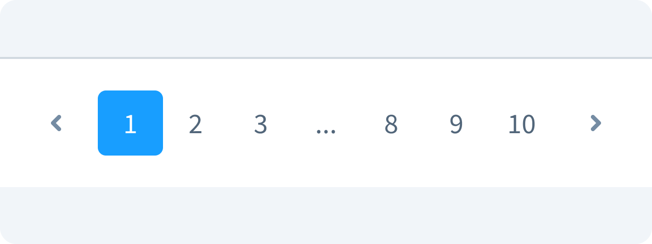 PaginationPaginations are used to split the listed data into sections for better performance.